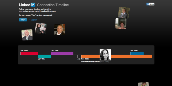
LinkedIn Labs, probably all jovial and such from the success of LinkedIn’s recent IPO, has a new fun tool you can use to visualize your career timeline in a very Memolane sort of way: LinkedIn Connection Timeline. Using semantic information contained with your Profile connections, this little hack creates a visual representation of your connections, your career points and the strength of those connections at a given point in time. Why do it? LinkedIn developer Gordon Koo explains the why of it:
A few months ago, I found myself thinking about my connections and the nature of my LinkedIn network. There was an “aha!” moment where I realized that LinkedIn has a unique characteristic which others lack — it is three-dimensional. The first dimension is the actual connection. The second is the implicit grouping of connections which tie the social graph together. Many social networks have these first two dimensions, but what makes LinkedIn’s network special is its third dimension: time.
Curious as to what your professional life in 3D looks? Check out the tool - it’s live on LinkedIn right now.

